

Preface
Over the last year, Ian White – mainly – and I have done a lot of work on siman, a suite of Stata commands1 for exploration, visualization and analysis of simulation studies2. Here is the GitHub repo. This post is about so-called “zip plots”, which I first started playing with nearly a decade ago, and are featured in siman.
Zip plots are a really effective visualization tool for understanding the results of some simulation studies. Recently, I was discussing one with a collaborator and it helped me to see a lot of things fast. They said they did not know how I was reading things off the zip plot, which prompted this post.
Where did the idea come from?
You’ve probably all seen plots of confidence intervals against their repetition number, right? They have some resemblance to forest plots. See for example the animated visualizations on Kristoffer Magnusson’s site. Note how intervals that ‘cover’ get a black horizontal line and those that do not get red.
A zip plot takes the collection of intervals from a simulation study and ranks them so that the “best” coverers are at the bottom and the “worst” at the top.
This is usually done, in ADEMP parlance, for each data-generating mechanism, method of analysis, and estimand. I calculate the sortorder according to p-values (constructed with the “null” to be the true value of the estimand) but there are other ways you might do it. Really you just want a best-to-worst sorting of the intervals.
An example simulation study
Let’s set up a toy simulation study. Below is a brief description.
Aim: to demonstrate how to read zip plots.
Data-generating mechanisms: Y~N(1,1), with two sample sizes 10 and 50.
Estimand: E(Y)
Methods of analysis
Method A: point estimator is the sample mean and standard error is calculated in the usual way. This is our benchmark method.
Method B: point estimator is sample mean × 0.8, with SE calculated using residual squares from this point accordingly. This method because it’s obviously biased (20% towards 0).
Method C: point estimator is the sample mean but SE is calculated using n–1 instead of √n–1. I’m doing this so that the SE is too small and intervals are too narrow.
For all three methods, inference is based on the t-distribution.
Performance measures: N/A (though what we visualize will tell us about bias, empirical SE, Average model SE and coverage).
Implementation: 5,000 repetitions. Stata 18. Main community-contributed package is the siman suite (which has a couple of dependencies it should tell you about if you try it).
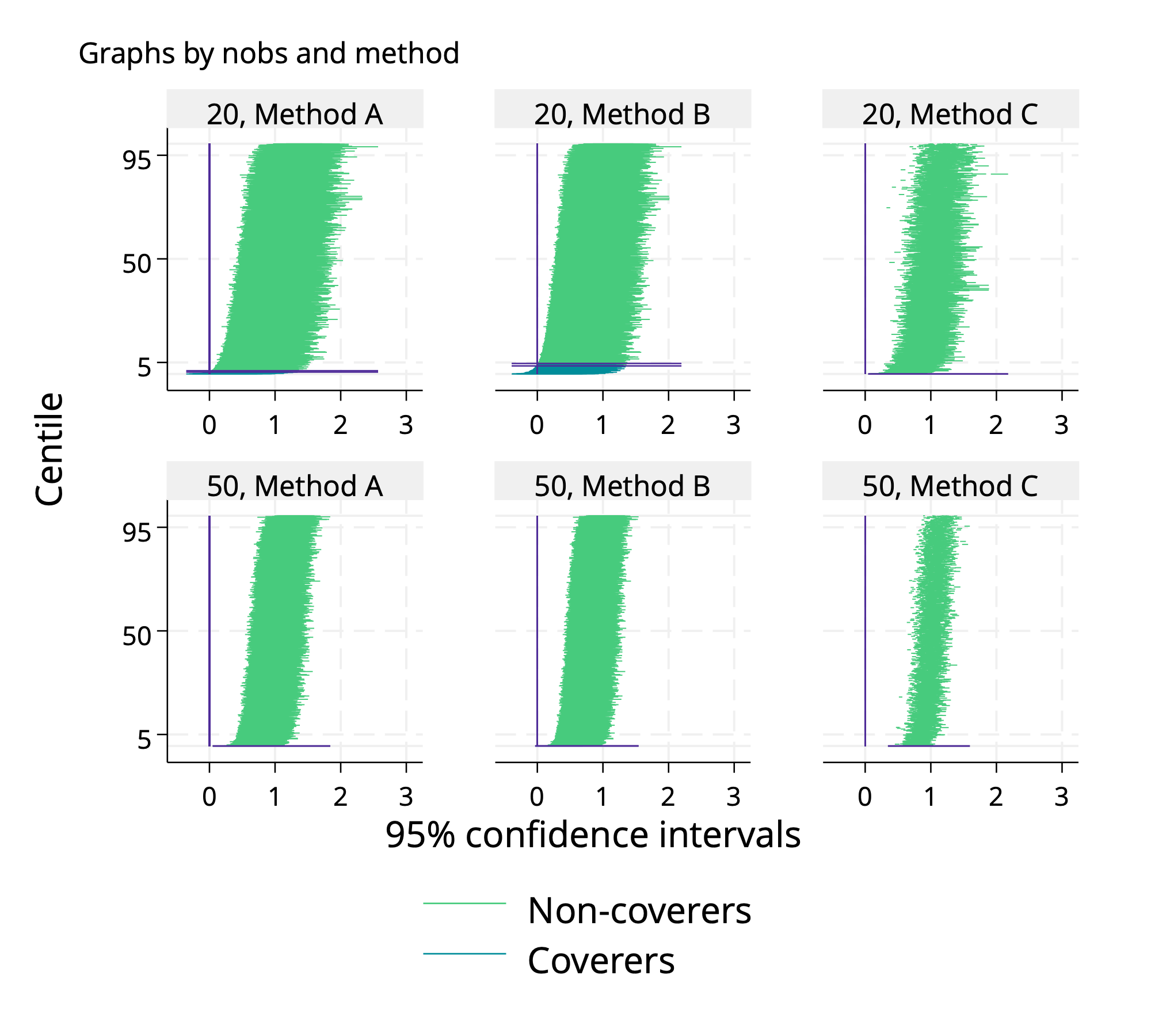
Without further ado: behold the zip plot.

Before interpreting it, let’s make sure we understand its anatomy. All panels in the top row show results under the n=20 data-generating mechanism and the bottom row relate to n=50. Results for method A occupy the left panels, method B the middle and method C the right. Within a panel, each confidence interval is plotted as a horizontal line3. As noted above, the vertical sortorder is a best-to-worst. There is a vertical line at the true value of E(Y), here 1. Intervals which cover it are plotted in blue towards the bottom, and intervals which do not cover it are in green towards the top. There are some extra horizontal lines (in purple) we include near to where the intervals switch from blue to green (see footnote4).
Now that its structure is clear, what can we read from this zipplot?
Method A is how a “good” method should look on a zip plot. Intervals appear equally on both sides, and 95% of them trap the true E(Y). The visual effect is that of a zip done up nearly to the top5.
Intervals are systematically narrower along the bottom row of panels than the top. For Method A, which has good coverage under both sample sizes, this shows that empirical SE is lower with n=50 than n=20.
For Method B, we see that intervals are more sparse on the right hand side than the left. This is how we can “read” its bias. As a consequence, we see that the colour changes from blue to green before the 95th centile: this is undercoverage (aside: bias tends to produce low coverage). The bias is worse for the DGM with n=50 than n=20. This is because the bias does not go down, but the intervals are narrower, as noted above.
For Method C, there is no suggestion of bias, but the intervals switch colour well before the 95th centile. This is because the standard error estimator was estimated wrong, so it does not accurately estimate the SD of the point estimator. As a consequence, the zip is half unzipped for Method C.
If you think you get the idea now, let’s test it with some out-of-sample prediction: what would you see for Method B if instead of Y~N(1,1) our two DGMs had used Y~N(0,1)? Would results be as above or different? Why? What about Method C?
If you find you are unsure, try coding up this simple simulation study with the changed DGM and interpreting what the zip plots are saying.
Some further thoughts
In the above example, it was clear that Method B would be biased and Method C would underestimate uncertainty. We saw in the zip plots what we already knew to expect. Of course, we would usually use them to see properties we don’t already know.
Zip plots scale pretty well as small multiples. I used a 2-by-3 grid above, but it would have handled 4-by-6 fine, and I’ve seen plenty more without them becoming unreadable.
I like the above design where the intervals are “folded” such that the sorting doesn’t care if the interval misses to the left or to the right but you don’t have to do it that way and could “unfold” the plot easily enough. It wouldn’t look very zippy though.
You can also use the zip plot machinery to visualize power. Now we sort intervals by using the null (here I’ve used 0) as the “true” value and test against that. Also, we now want non-coverers because that implies a powerful method. Here is the power version for my example simulation study6.
This was initially written by Ella Marley-Zagar, who did an excellent job on a really hard-to-write suite!
To be more precise: for working with “estimates data sets” arising from simulation studies. R users: functionality is similar in Alessandro Gasparini’s excellent rsimsum package, which built on Ian White’s simsum Stata command.
I often include the point estimates for each interval (as a white dot) but kept this one minimal.
HENCE THE NAME. Bit of trivia: I first did the ranks the other way up with worst at the bottom and best at the top, and toyed with naming them “Eiffel tower plots”. At another time I transposed the axes and called them “trumpet plots” (this was a bad idea because you lose the ability to spot asymmetry).
The point at which the intervals change colour is the coverage estimate. The two lines plotted are the two-sided 95% Monte Carlo confidence interval for estimated coverage.
This also shows what I meant by unfolding the intervals.